Back
A website redesign that moved a fintech from financial first aid to long-term partner
Project goal
To rebuild a lender's website around a new brand story, moving it from the place you go when something breaks to the partner you keep once it is fixed.
Our scope
UX/UI design
3D modelling
Project duration
2022
Technologies used
Adobe XD
Adobe Photoshop
Adobe Illustrator
Blender
Client
Wealthon
A brand that needed to stop being a helper and start being a partner
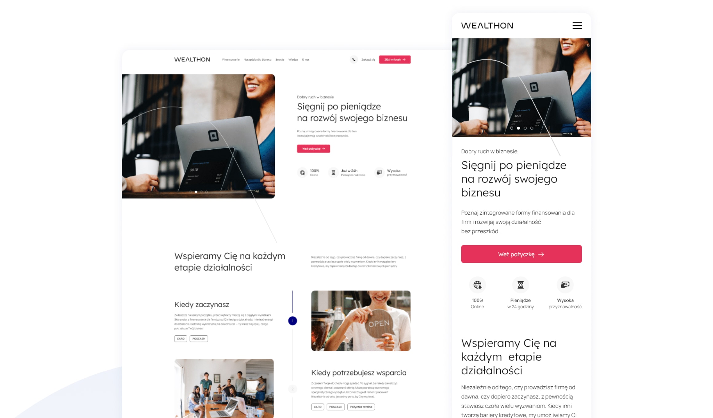
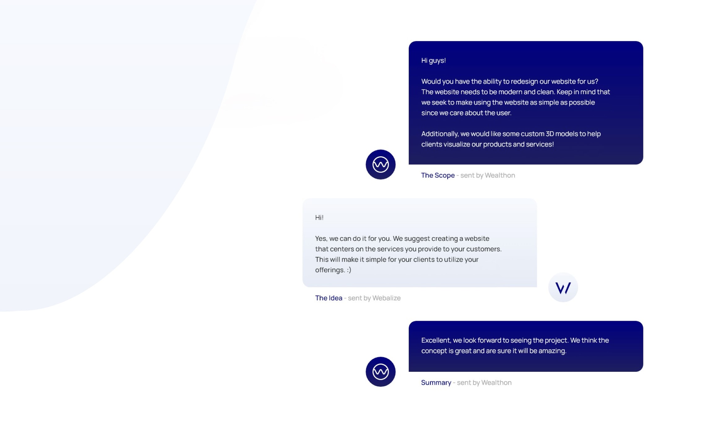
Wealthon lends to the Polish businesses that banks have stopped saying yes to: small firms and sole traders, in gastronomy, beauty, retail, construction and the like. It arrived with an unusually clear problem. Its old site sold rescue, so the brand had come to mean the number you call when something goes wrong. That was limiting. Wealthon had built a wallet app, a payment card, terminals and financing against terminal takings, which is a toolkit for running a business rather than a lifeline for a bad month. The brief the client handed us named the shift outright: from helper to partner, from caregiver to companion. The site had to carry that.
They came with a strategy, which is rarer than it sounds
Most redesigns start with someone hoping the design will supply the thinking. Not this one. Wealthon arrived with a strategic brief: what the brand meant now, why it was moving from lendtech to fintech, the products it was building and who exactly it was talking to. The audience came drawn as people rather than segments, from a caterer a year into her business to a dentist waiting on a bank decision. We could design straight at them. When a client does that much work before the kickoff, the design gets to be about design.
Three stages, in the order that keeps a redesign honest
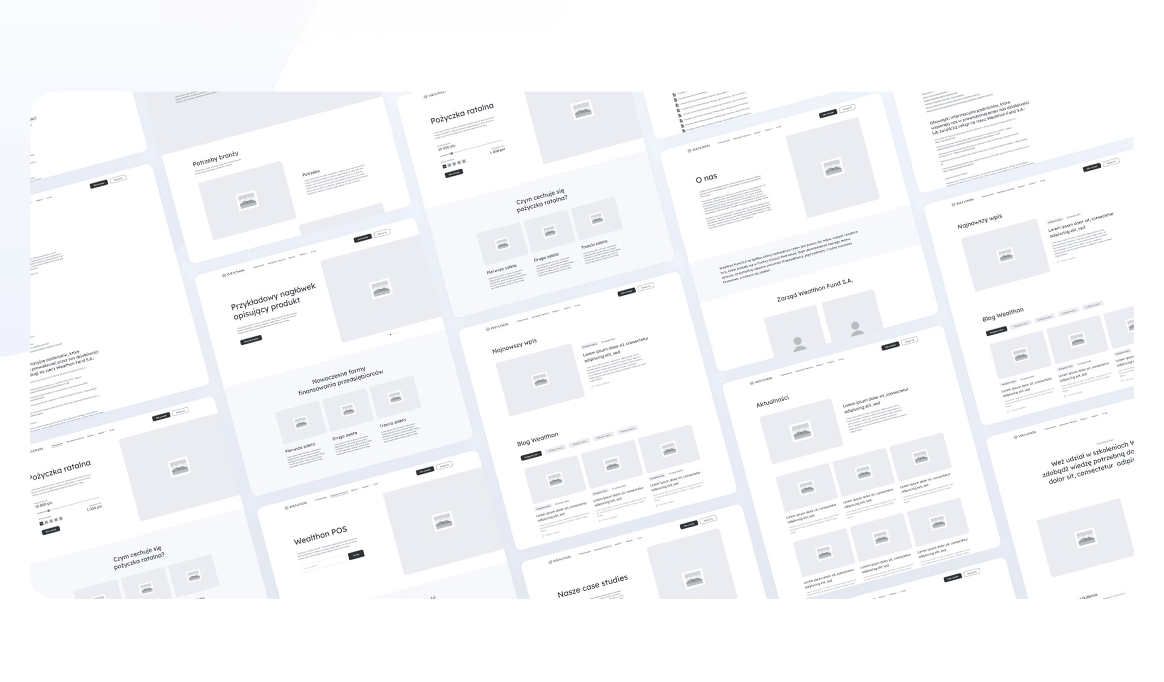
The work ran in three: an introduction stage to understand the business, a kick-off to agree what we were making, then design. Wireframes came before anything pretty, wired into a clickable prototype so the client could move through the site and react to it rather than approve a picture of it. Structure got settled while it was still cheap to change.
Help now, support tomorrow, laid out as one story
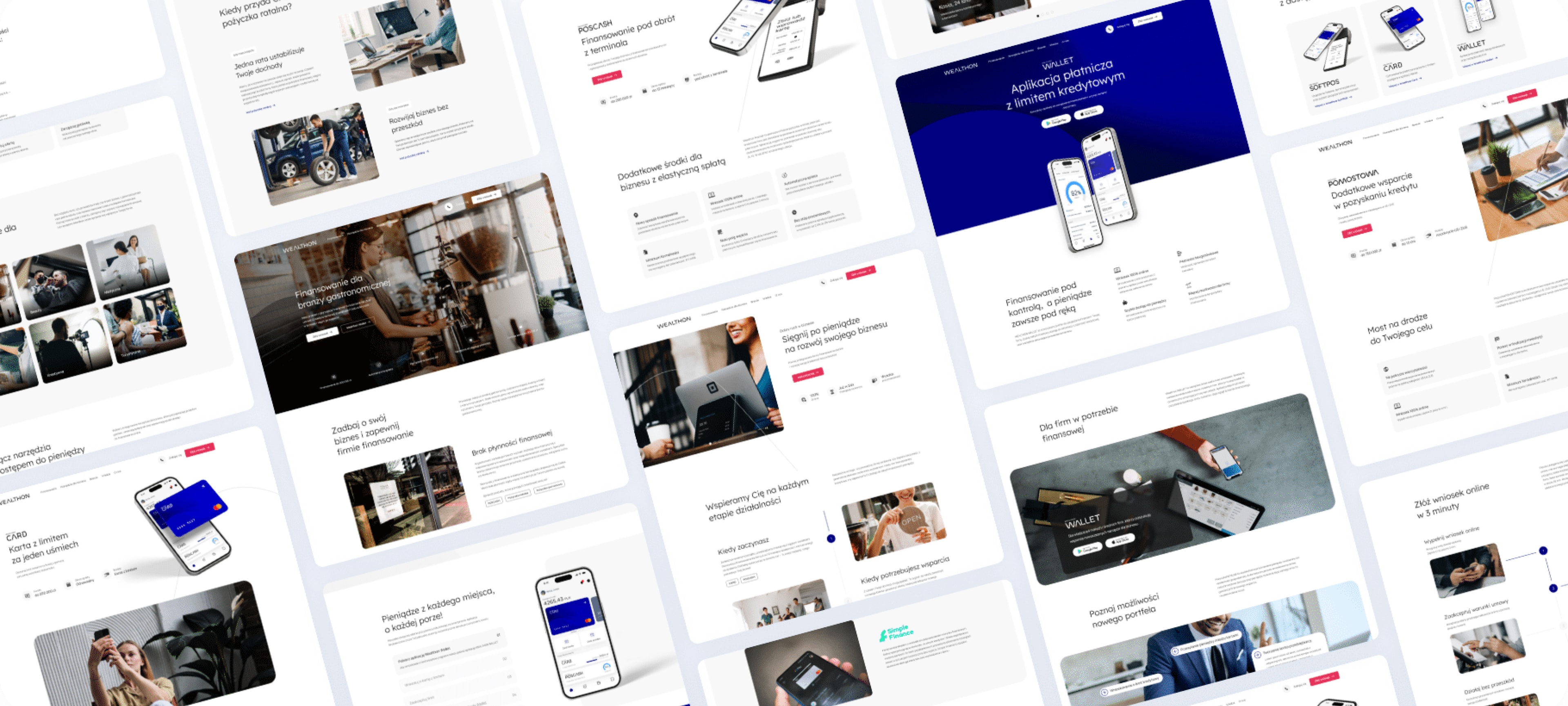
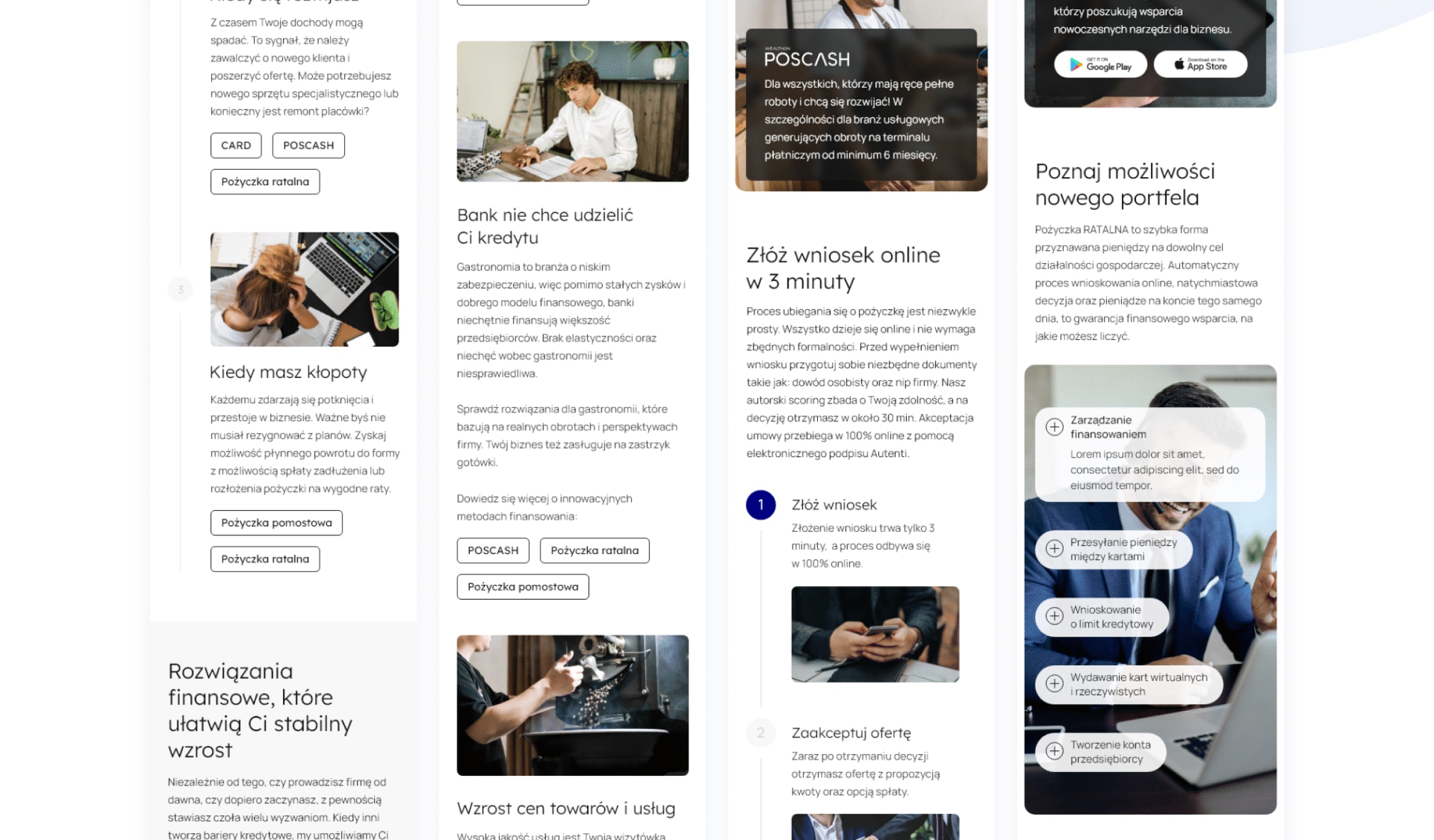
The structure follows the brand's own logic. Wealthon does two things: it helps in the moment, then it supports what comes after. So the site sorts itself the same way, walking a visitor through the life of a business, from starting out to needing a hand to hitting real trouble, then meeting each stage with the product that fits. Underneath sit the plain promises a small-business owner cares about: the application takes three minutes, plus here is the answer for your industry specifically. It is a quiet piece of information architecture. It is also the whole argument the brand wanted to make.
A design system, two typefaces and the discipline to stick to them
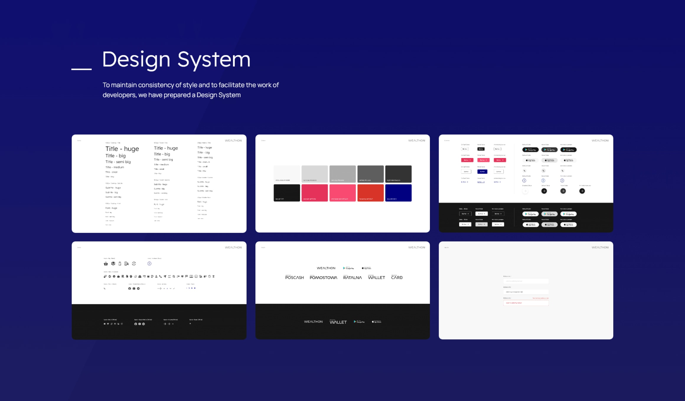
Under the pages we built a design system: components, spacing and styles kept consistent so the site would hold together as it grew. The typography is two faces chosen to complement each other, Lexend Light next to Manrope, which for a lender matters more than it sounds. Financial products are a wall of numbers and conditions. Type is what makes that read as clarity rather than fine print.
Products that are half virtual, modelled in Blender
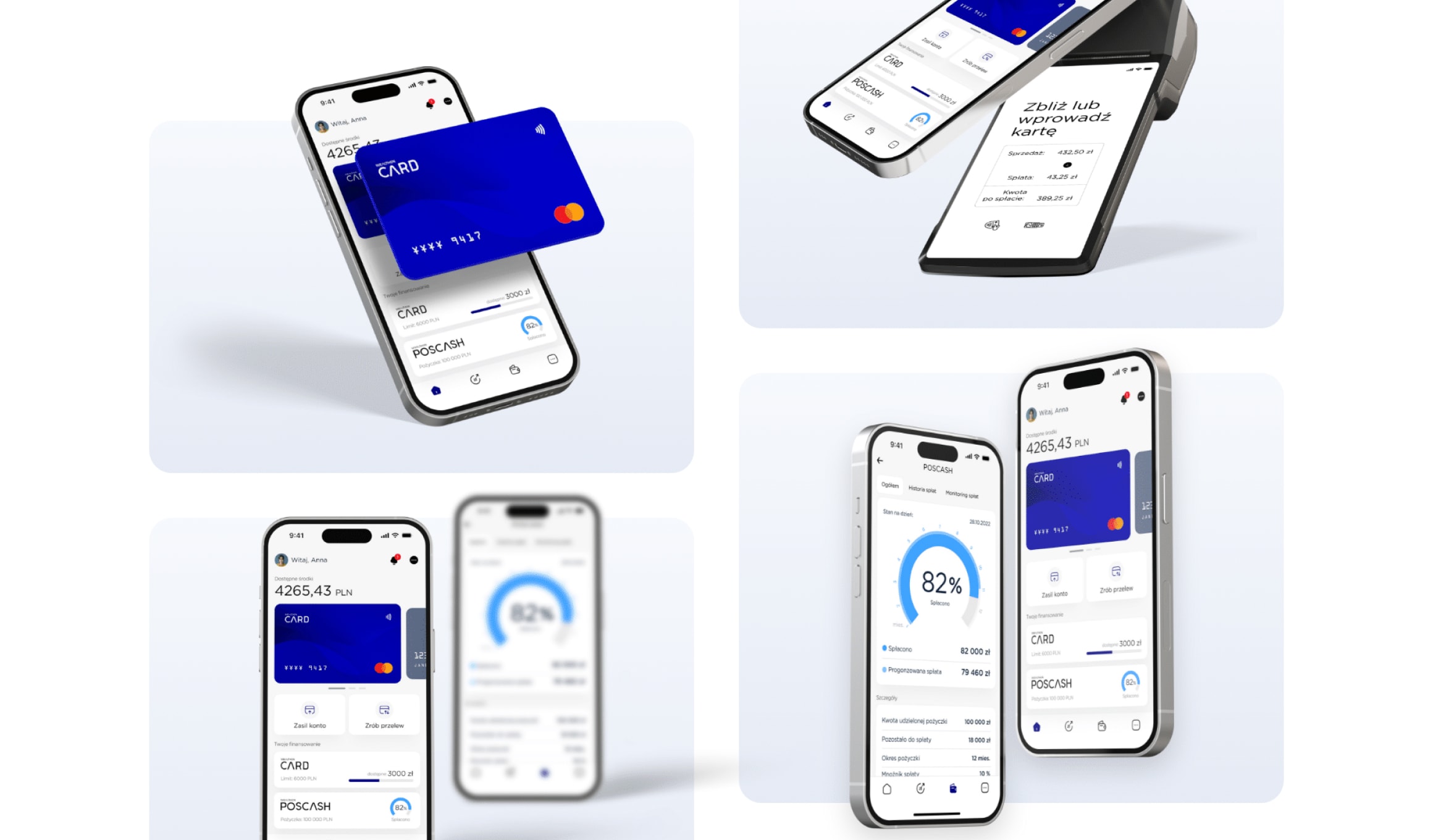
Then a practical problem. Wealthon's products are difficult to photograph. A card with a credit limit, an app, a terminal: some of it exists, some of it is software, none of it photographs well as a set. So we modelled them in 3D in Blender and rendered them for the marketing material, which gave the brand product imagery it could light, angle and reuse however it needed, with everything looking like it belongs to the same family. Total control, no photoshoot.
Then mobile, because that is where a small-business owner actually reads it
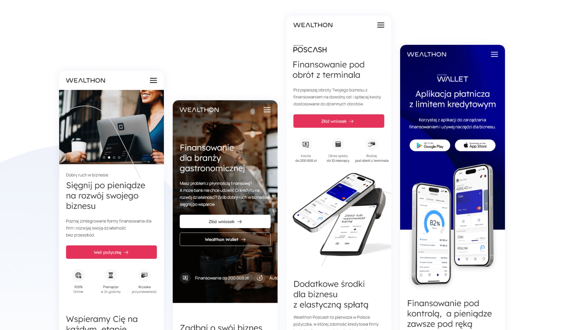
Responsive design came at the end, once the desktop thinking was settled. It deserves the mention because of who this site is for. The people Wealthon lends to are running a salon, a van or a kitchen, so they are not comparing financing at a desk. They are doing it on a phone between jobs, which is exactly when a three-minute application has to still feel like three minutes.
Outcome
We delivered a design for a site that matches how the brand wants to be seen: as a set of ongoing tools for small businesses. We also provided a library of 3D product images for the marketing team. Our job was to design it and the structure we created is still used by the business today.
Let's talk about your project idea!
Tell us about your project. We’ll help you plan the architecture, scope, and execution.
© Webalize 2026