Back
A website redesign giving a venture capital fund across Europe and Asia a sharper presence
Project goal
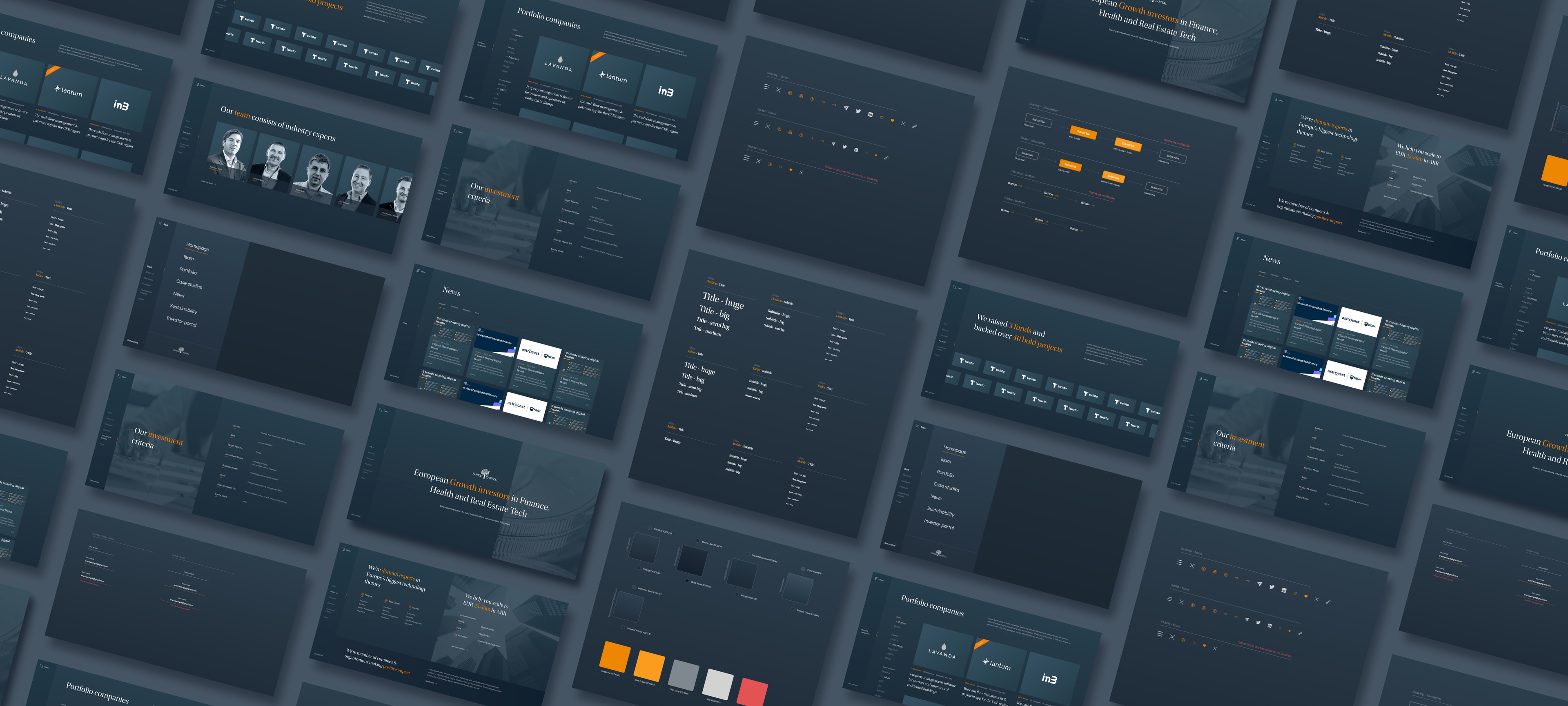
To give a venture capital fund a website with the polish its own portfolio would expect: fast, quietly animated and run by the fund itself.
Our scope
UX/UI design
Development
Project duration
April-December 2022
Technologies used
Next.js
Strapi CMS
Client
Finch Capital
The client who recommended us was one of their own investments
This one came to us the best way a project can. We had designed and built the website for SMEO, a fintech lending to small businesses. Finch Capital is one of SMEO's investors. When the fund needed a new site of its own, SMEO put our name forward. When a company that your prospective client has invested in recommends you, it's hard to find a stronger endorsement. It says more than any pitch deck we could have sent.
A fund that backs the technology rewriting financial services
Finch Capital invests across Europe and Asia in the innovative technology driving the transformation of financial services. That is a specific promise. A website is where a fund makes it credible. We handled the whole thing, from the first concept work in April 2022 through design and development to delivery that December (with break in the middle due to hot investing period).
We designed it as a system before we designed the pages
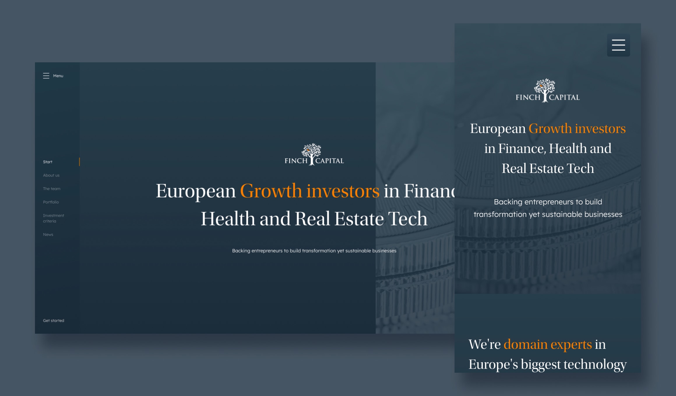
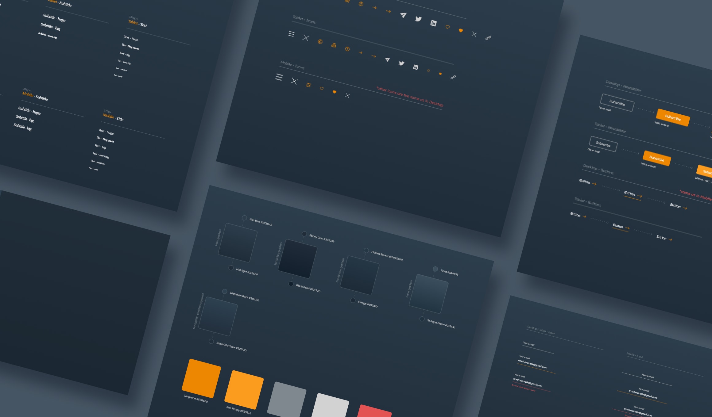
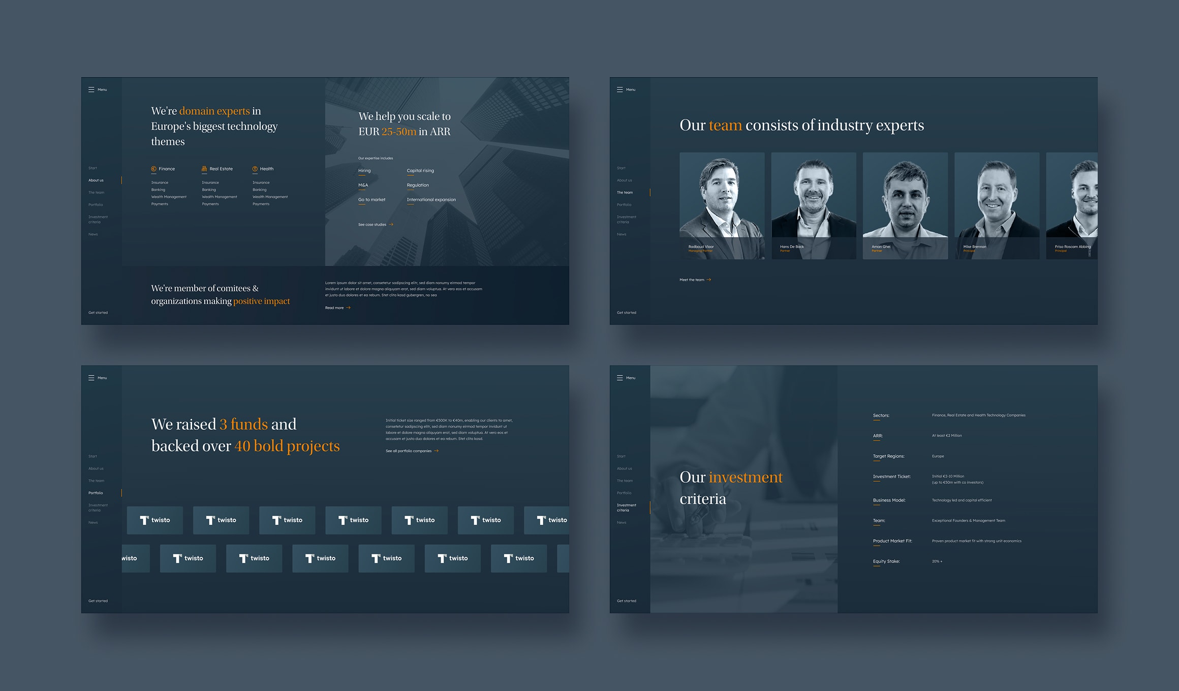
The work started with a design system and carried through to mobile and desktop designs in step rather than as an afterthought. That system went straight into the code, where the front-end is organised the same way, from atoms up through molecules and organisms to full templates. Design and build speaking the same language is what keeps a site consistent. It is why new sections could be added later without anything drifting.
A homepage that moves the way a fund's pitch does
The homepage is not a scroll down a long document. It is a sequence, a story. Each section arrives as its own screen as you move through it, with animation carrying you between them and smaller motion catching the eye once you land. It reads as a deliberate order rather than a pile of content, which is exactly how a fund tells its story in a room.
The portfolio as a real dataset, not a wall of logos
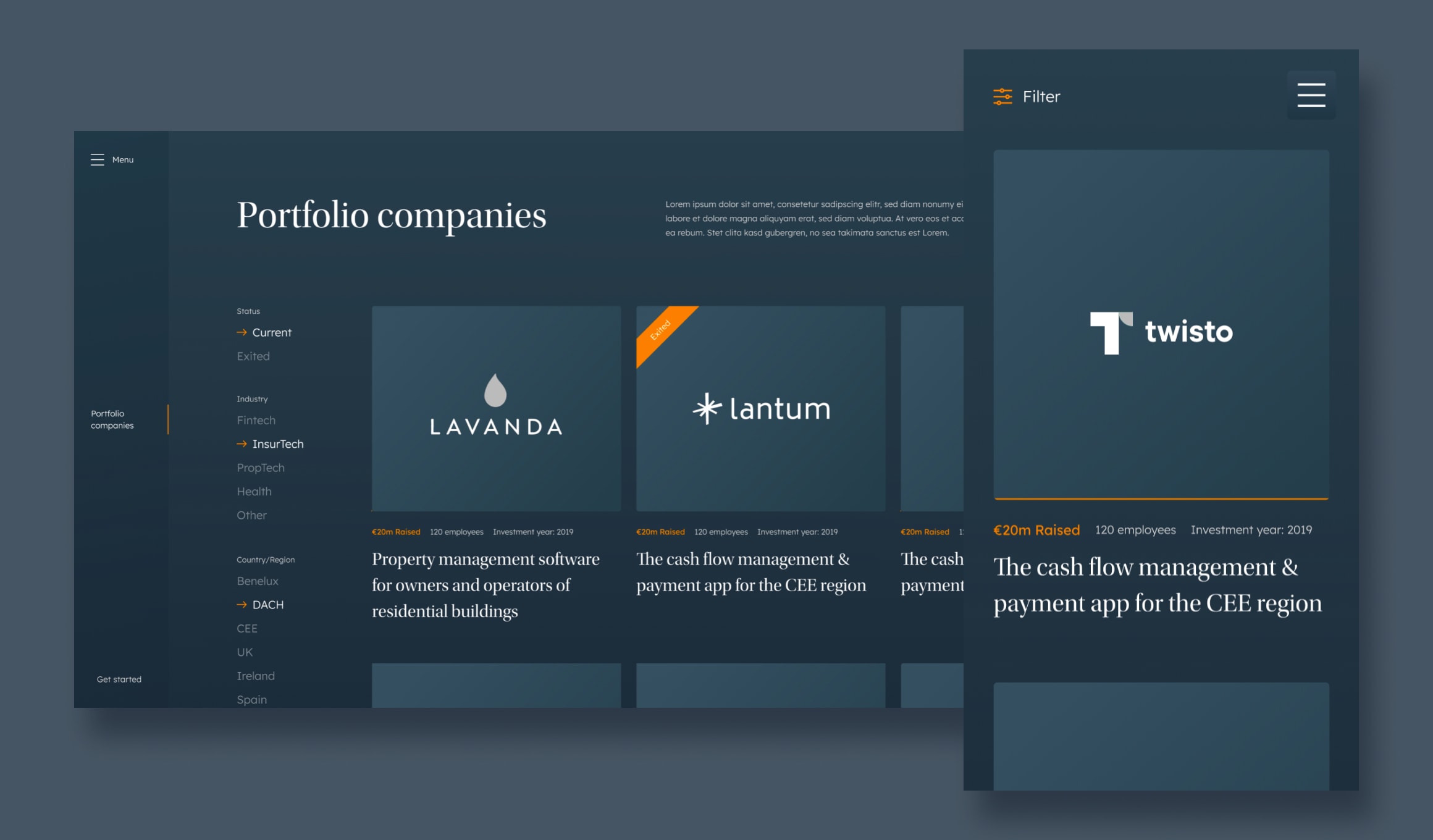
Most fund websites reduce a portfolio to a grid of logos. We modelled it properly instead. Every company carries its industry, location, the year the fund invested, how many people it employs and how much it has raised, with a flag for the ones the fund has already exited. Each is also linked to the partners behind it, in both directions, so a visitor reading about someone on the team can jump to the companies they back, then jump back the other way from a company to the people who backed it. A founder can filter to the industry they are in and see who else the fund has trusted there. That is the question they actually came to answer.
Everything else a fund needs to say
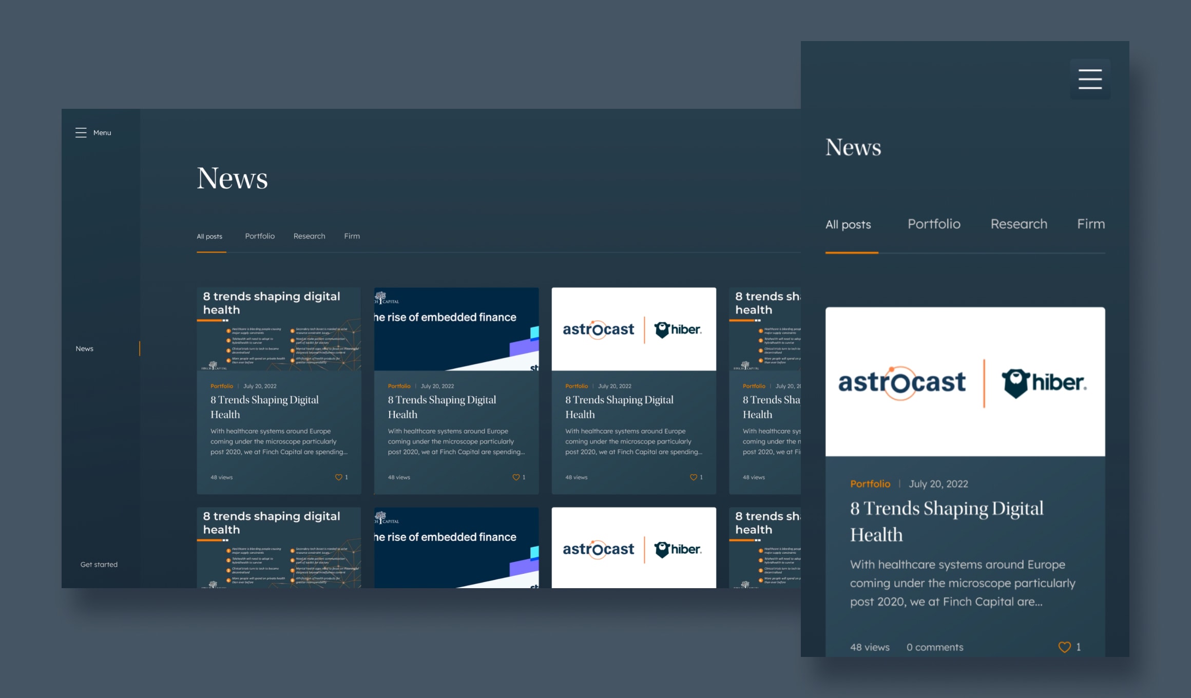
Around that sit the rest of the fund's pages, each one a proper part of the site rather than a stub. There is a team page with room for a real biography per person, news with categories and its own posts, case studies and a sustainability section covering how the fund thinks about its responsibilities. A newsletter sign-up runs through Mailchimp. A notification banner can be raised whenever there is something the fund wants everyone to see first.
Next.js in front, Strapi behind, run by the fund
The front-end is Next.js, generating pages statically so the site loads immediately, with Strapi behind it as the CMS. The fund's team manages all of it themselves: portfolio companies and their industries, people, news posts with SEO on each one, the page content and the banner. Adding a new investment is a form, not a phone call to us. For a fund whose portfolio changes several times a year, that independence is the whole point of choosing a CMS at all.
Outcome
What the fund had at the end was a site with a clear story told in sequence, a portfolio someone could genuinely explore, smooth animations and a CMS that let the team keep all of it current on their own.
Let's talk about your project idea!
Tell us about your project. We’ll help you plan the architecture, scope, and execution.
© Webalize 2026